|
|
Location: GUIs >
Windows >
Windows 10 Screen Shots  Honestly, Windows 10 is a steaming pile of shit that is only slightly better than Windows 8 and I really just don't want to fuck with it. Which is why they are trying like mad to push this out to Windows 7 users. They know nobody wants it. Oh, but it is a "free" upgrade!
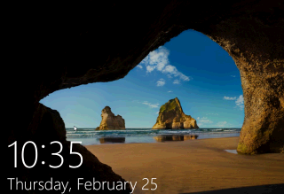
Well, finally, we have our answer. THIS IS A PLACE HOLDER FOR ADVERTISING!
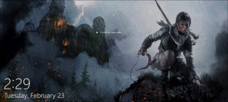
And now they are starting to push some out. So if you start up your Windows
10 computer, you might instead see this advertisement for some video game:
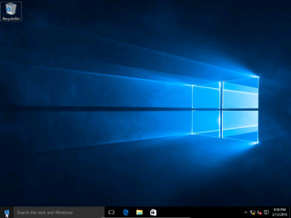
First of all, holy shit this is a dark desktop theme. It feels like it was designed by someone who was massively depressed. I think I'll go slit my wrists now. My eyes are already bleeding trying to read dark gray text on darker gray. Please kill me.
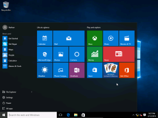
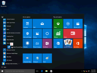
As with Windows 8, every "app" here by default is basically advertising, and requires Microsoft's internet services. If you give them some data to chew on the "live tiles" will display insanely annoying animation. Also that search box takes up an annoying amount of space in the task bar.
Like Windows 8, this still shows one long list of all programs, but now it is in one single scrolling column. At least they have rediscovered folders. You can expand any folder or group to show all of the programs within, and close it to somewhat shorten the list. You can then "pin" your real applications to the start screen by dragging and dropping. Incidentally, you could add icons to the top of the Start Menu on Windows 95.
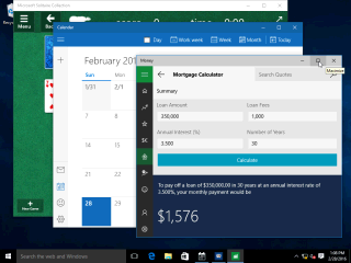
WELCOME TO THE ADVANCEMENTS OF 1987 AND WINDOWS 2.0!!!! You may also notice that the metro-ish applications have been restyled so they have a mostly iconic menu bar down the left side. (What, no ribbon?)
So far I haven't seen that retarded "Charms Bar". Looks like they got rid of it. Hopefully they also got rid of whoever thought that was a good idea.
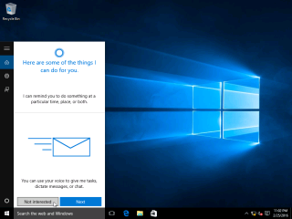
First they try and bring back touch screens and now they try to bring back speech recognition. Because we all know how pleasant being in an office full of loud talking idiots is. But Cortana promises that after giving you help writing that letter, there will be cake and grief counseling!
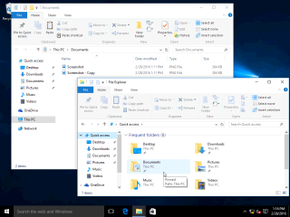
Notice the default placement of Microsoft's OneDrive service as a location. OneDrive is Microsoft's file hosting service. You are supposed to give them your files so they can analyze them for marketing data and bank account numbers.
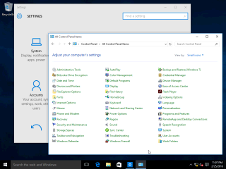
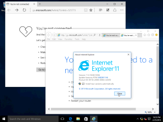
Off hand, I don't really know (or want to know) how much is shared underneath the hood. Reports have it that they use different rendering engines. Perhaps this is to address local applications that are assimilated by IE breaking every time they updated it.
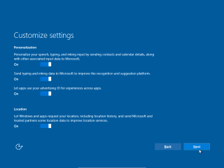
A prominent new feature of Microsoft Windows 10 is "Telemetry" this sends back all kinds of unknown information to Microsoft. If you think you can completely turn it off, you have another thing coming to you. Basically, until someone audits every line of code, publicly documents what it does, and holds Microsoft accountable to not make changes without public documentation, you should assume it is snapping naughty pictures of your 8-year old daughter.
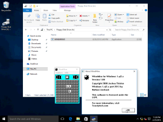
There was some talk that Windows 10 would not support floppy disks, but it seems to work fine, at least for standard 1.44mb disks on a real FDC.
Why not add more advertising at shutdown? And don't forget to send telemetry back to our good friend and advertising executive Satya Nadella. In conclusion, at least they tried to bring back the regular desktop in Windows 10. It is a bit of an improvement over Windows 8 - but anything would be. However, if you still have Windows 7 then hang on to it for dear life. There, that ought to settle the little S.O.B.s. |
