|
|
Location: GUIs >
Linux / Unix >
The AT&T PC 7300 / Unix PC "Unix PC" Screen Shots
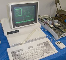
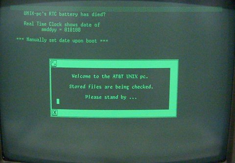
Recently I got a chance to try out an AT&T "Unix PC". The AT&T PC7300 (or 3B1) AKA the "Unix PC" is a Motorola 68K based machine, with a hard drive, and bit-mapped monochrome display sold by AT&T in the mid 1980s. It runs a Unix System V based OS, and integrates a rudimentary windowing system. Update: There is a new AT&T Unix PC emulator, their web site is here: AT&T 3B1 Emulator. That gets far enough to run the GUI. I don't see any binaries posted, so adding a copy here for good measure.AT&T Unix PC 3B1 Emulator.zip. Since I didn't have access to make screen dumps (assuming it has a screen dump utility), and no emulator exists, I just took photos.
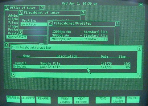
It starts of with an "Office Menu" that leads you to other functionality available through the GUI. No icons or other objects reside on the desktop itself. All applications present themselves as an additional window. The top of the screen is a status area, that normally shows the date. Notably, the bottom of the screen displays "soft keys". During the early 80s, some integrated application environments used soft keys as an alternative to function key overlays. Different applications may use the function keys differently, so this visibly shows what each key currently does. On this system you can either press the function key, or select the softkey with the mouse.
All of the windows in this windowing system seem to use the same style. A "move" control appears in the upper left corner. You grab this control
with the mouse to drag the window around.
An up and down scroll arrow may also appear on the rightmost border.
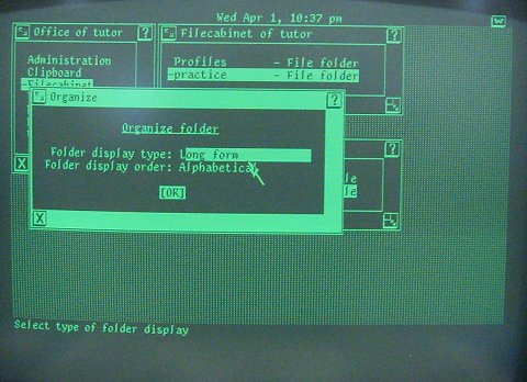
Of note, you change the options by clicking on them with the right mouse button. This dialog has an "OK" button, but most rely on keyboard keys.
You can choose a window from this list to bring it to the foreground. This is similar to the Application Menu in MacOS 7 and later.
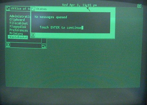
Clicking on it displays a window with a list of recent status messages.
Another thing to notice about the window management, window edges can not exceed the lower or right edges of the screen. Additionally, there appears to be no way to minimize a window. |
