|
|
Location: GUIs >
Windows Shells >
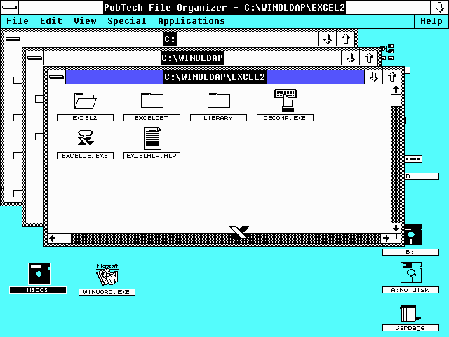
PubTech File Organizer 2.11 Screen Shots Well, I knew there were a number of alternate desktop shells for Windows 3.x but I never knew anybody had made one for Windows version 2. Apparently in 1987 a company called PubTech took up the challenge to make a Macintosh-like user interface for Microsoft Windows. One of the big limitations of the time was memory. Windows 2.0 was only designed to use 640k of ram - the limit of the original IBM PC. This was much more than the 128k that the original Macintosh had, but using more memory for the desktop shell than the default MS-DOS Executive could mean that memory hungry application software might have problems running. This version of PubTech File Organizer recommends using Windows 2.11 with EMS or Windows 2.11/386 with extended memory. It will still run in real mode with only 640k on any version of Windows 2.x. There is also a later version of this software for Windows 3.0 as well as free demo version (also for Windows 3.0). It is not really clear what happened to the company "Publishing Technologies, Inc." that wrote this software. It sounds like this was a small company and they probably either went out of business or got bought up. I am also wondering if there was a PubTech File Organizer version 1.0 and if it ran on DOS or an earlier version of Windows. The early 1987 copyright date suggests a first release for Windows 2.0 but then what did they develop it on?
It is interesting to note that to start the software you are supposed to start windows from the PubTech folder by typing "win file" at the DOS prompt. It might just be a coincidence that the Microsoft File Manager in Windows 3.0 was named "Winfile.exe"
There are icons for floppy drives, hard disks and other drives present on the desktop as well as a "Garbage" icon. Drives and folders open in new windows (properly cascaded too!) and files are represented as icons. Various file types are associated with designated icons. The icons in executable files - which were previously only shown when an application was run and minimized - are used for the icon of the executable file. The desktop itself works like the original Macintosh. It is not an actual folder that contains files, but icons can be dragged to it and kept there until they are "put away". Its menu bar appears at the top of the screen but because it works within the Windows UI there is a title bar above it. It is actually just a regular application that is running full screen and stays in the background. It can even be minimized by clicking on the minimize arrow in the upper right. You can run multiple applications from the File Organizer. When applications are minimized they still appear as icons on the desktop as they normally do in Windows 2.x. In the above screen shot the MS-DOS Executive is running but is minimized. The Microsoft Word icon however has just been placed there by dragging the icon from the folder and is not running. An odd quirk that is quickly noticeable is that drive and folder icons do not "gray out" when opened, instead they disappear. In the screen shot above the C: drive is present and open but the icon is no longer visible on the desktop.
This feature feels quite similar to the Windows 9x/NT "Start" menu.
|


