|
|
Location: GUIs >
Apple >
NeXTSTEP 0.8 Screen Shots
The "Previous" NeXT emulator has just gotten to a point where it can boot NeXTSTEP to the desktop and run applications. Thanks to that, I am now able to get some screen shots of NeXTSTEP 0.8 and other early versions. Previous does not currently implement sound or networking. NeXTSTEP 0.8 is the earliest recognizable incarnation of what is now known as MacOS X (And to some extent, iOS). It was demonstrated by Steve Jobs in 1988, and shipped with very early NeXT hardware. NeXTSTEP was built on top of the Mach Unix kernel, and in 1988 was up against commercial UNIX's, OS/2 1.x, Macintosh System 6, and Windows 2. I sometimes wonder how Steve Jobs felt about basing NeXTSTEP on Unix. There certainly wasn't much choice. There wasn't time to write an entirely new OS from scratch, and they needed to attract existing developers. But common Unix environments were almost the definition of "user unfriendly", or even "user hostile", with archaisms that would seem out of place unless you were running a 1970s PDP-11 with spinning reels of magnetic tape. Depending on your boot settings, the NeXT will either greet you with a simple logo and animated hard disk, or you will see the above boot screen showing all of the Unix-ish startup details. A NeXT can also boot directly to a firmware "Boot" command prompt. Using the Boot command prompt, you can boot NeXTSTEP to a "single user" unix command prompt, or from other devices. This is similar to the Open Firmware used by Sun and later PPC Macintoshes. "Faking root mount entries"? Did Dolan work at NeXT? SteefJerbs, plz.
The first thing you might notice about NeXTSTEP or a NeXT computer is that it uses a very high resolution: 1120*832 grayscale! And this was in 1988 when 640*480 VGA was still catching on. Ironically here in 2014, most "modern" LCD displays still don't have that vertical resolution. A few basic things about the desktop, or Workspace Manager:
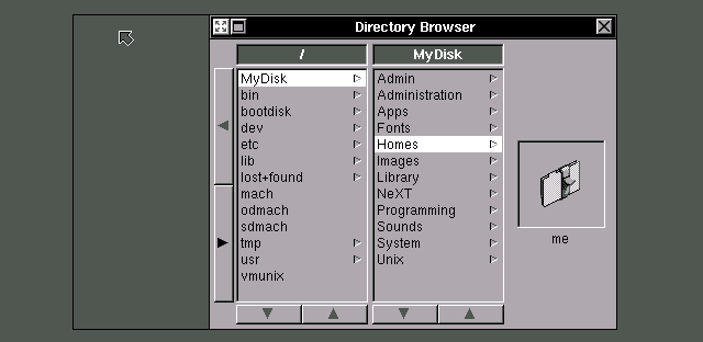
Each window can be viewed as icons, a bare list, a detailed list sorted by name, date, or size, or a "Directory Browser" By default, the file window appears as a "Directory Browser". Instead of just providing a list of files, it focuses on navigating the directory hierarchy. This is necessary because NeXTSTEP systems have a huge number of files and folders with deep hierarchies.
You can not drag and drop items directly to or from the columns. Instead it displays a single icon of the selected item at the right, and you must drag and drop from or to that. The 0.8 Directory Browser uses large buttons for scrolling rather than the scroll bars found in later versions. The Workspace Manager forces you to keep one browser window open at all times. You can not close the last one, but you can "Miniaturize" it. The file system organization itself is a confusing, Unixy mess. For example, it exposes the "dev" folder and raw devices to the end user, as if that were somehow a good idea.
You can drag and drop application icons in to the Dock. Then to start the application, just double click the button in the Dock. The dock stays visible at all times, and is never covered by windows. To remove an icon from the Dock, you drag the dock icon to the black hole. Dock icons can be spread out with gaps across the right of the screen. You can NOT put documents or non-NeXT application on the dock. In systems like the Xerox Star or Lisa, the interface tries to abstract and hide the direct launching of programs, instead focusing on creating documents. A toolbar or menu like the Dock does the opposite. But some programs such as electronic mail or telecommunications programs are difficult to abstract away. Still, this Dock feels like a quick and dirty hack to make up for the lack of desktop icons. |


