|
|
Location: GUIs >
Misc GUIs >
IBM Common User Access Samples
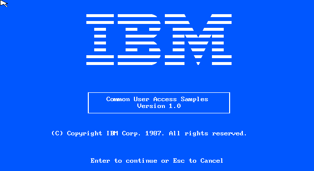
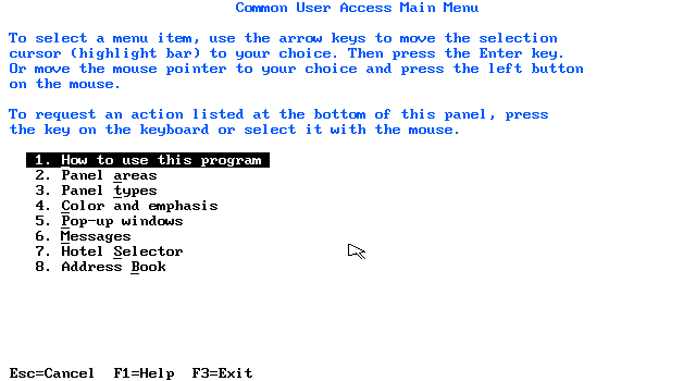
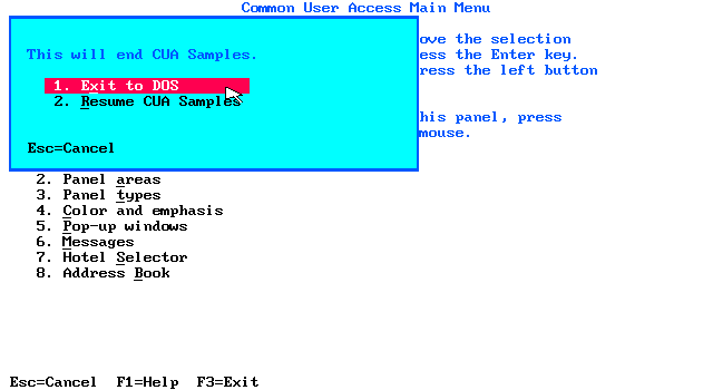
These are some sample programs from a disk that accompanies one of IBMs earlier Common User Access documents, "IBM Systems Application Architecture: Common User Access: Panel Design and User Interaction, Document SC26-4351-0, 1987" (Not currently known to be on the web) IBM's "Common User Access" was a set of specifications designed jointly with Microsoft as a guideline for a standardized user interface across a wide variety of software products, both for the PC and IBM mainframes. This sample program system contains sort of a guided tour through several mockup programs implemented using the CUA defined interface. This revision was released in 1987, about the same time as Microsoft Windows 2, and has some visual similarities. Some of the similarities remain in current Windows products. Of course, quite a bit is reminiscent of the 1983 Apple Lisa and 1984 Apple Macintosh. Later revisions of this specification were released, however after the IBM-Microsoft breakup they became increasingly irrelevant. If you wish to try the sample program yourself, you can download it here: IBM CUA Samples Diskette 1.0.zip
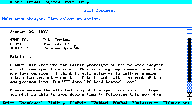
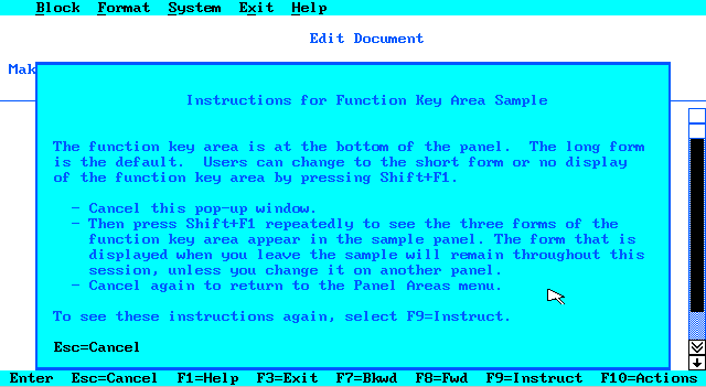
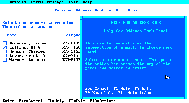
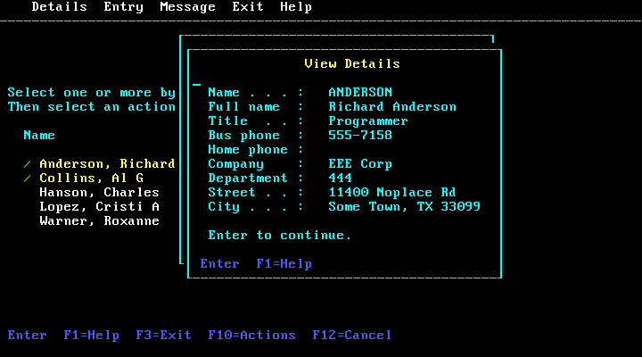
"Action Bar" refers to the menu bar at the top of the screen. "Panel body" is the term for the main content. "Pop-up" is content or dialog that appears in a window over the Panel. "Scroll Bar" - Similar to a modern scroll bar, it is an area with a draggable visually "raised" bar in the middle, somewhat proportional to the scrollable area. The single arrow on each end is supposed to allow scrolling a single line, while the double arrow scrolls multiple lines. "Function Key Area" is the bar at the bottom listing currently applicable function keys. You can use the mouse to click on these like "softkeys" (a term used elsewhere).. Remember, the keyboard is king. Toy touch screen users will be smacked upside the head with an IBM Model M clicky keyboard. Voice users will have the same Model M shoved down their throat.
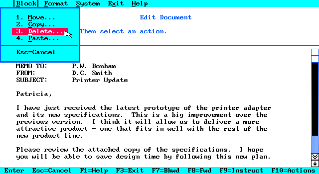
It behaves like a fairly typical drop down menu. Keyboard usage requires you to press F10, and then the underlined letter or arrow keys. There are no "Alt" hotkeys. Escape closes the drop down. Then it demonstrates how to use the "Panel Body", which is specific to an application.
These are the key assignments: F1 Get help for field or item or get help on
help from help panel
Enter Process panel or action
bar selection, or continue
Shift+F1 Switch to another form of function key area - short, long, no display A few of these are still present in some Windows applications: F1 launches help, F5 refreshes content, F6 moves selection between window body and URL bar, F10 sets focus on a window's menu. F3 was used to exit Windows setup.
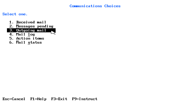
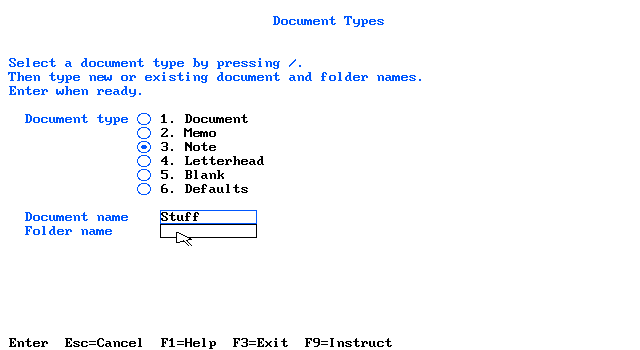
"Single choice, numbered list" - a simple numbed list like many DOS menus.
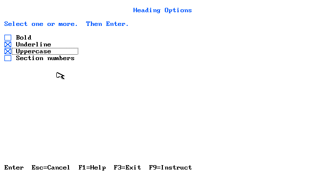
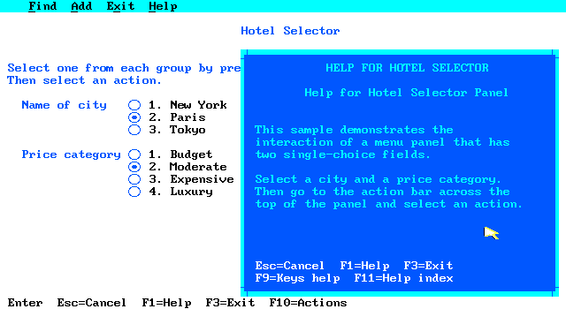
While the idea of using an entire screen or application window as a menu is not too common in a windowed environment (probably made a comeback on mobile crap), these demonstrate the use of checkboxes, radio buttons, and text boxes.
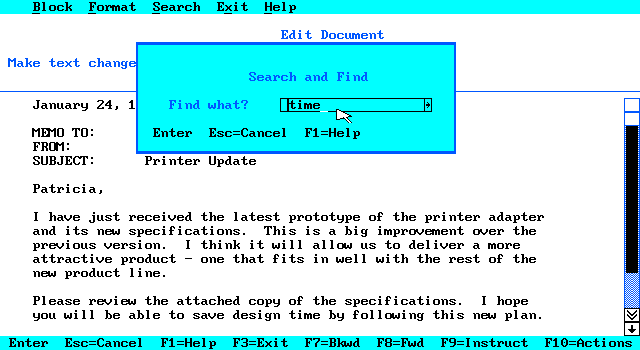
The demonstration is a little confusing but it points out:
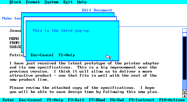
It seems to suggest that overlapping pop-up windows should have alternating colors, as shown above.
The dialogs in these samples do not use graphical buttons or windowing controls. This is likely because these represent both GUI and text-based applications.
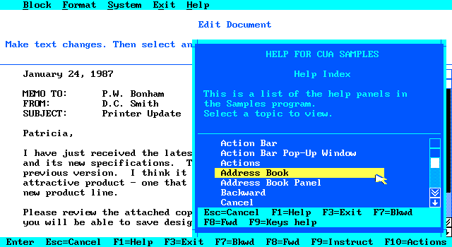
Notice that the help window appears as if it should be movable or resizable. However this mock-up does not implement any windowing control..
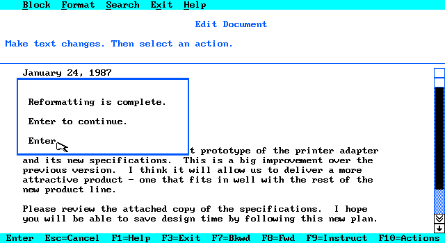
The first is a "Notification" pop-up. On a color display, this appears white.
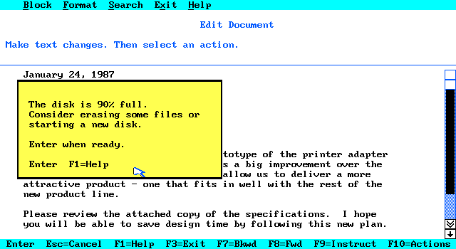
On a color display, this appears yellow.
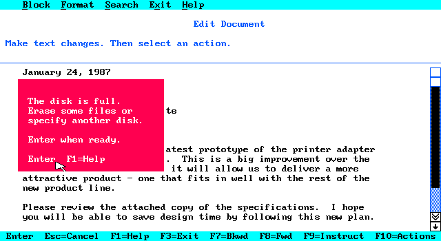
On a color display, this appears red. The only visible difference seems to be the color. In monochrome CGA mode, they look the same. Because these samples are text oriented, they do not use graphical icons. Regardless of how the popup windows are styled, the classifications are important. A specific application environment could chose to use other output (such as sounds, icons, or dialog titles) or user input handling, but it should be consistent for each class.
In this mode, the entire user interface is text-based, and does not use the mouse. The keyboard usage is bizarre as it requires using the control key instead of "Enter", and "F12" instead of Escape. In this mode the "/" key is required for making selections. Terminal mode also simulates the response delays one might see on a real IBM terminal product.
Although the samples are rather crude, they demonstrate some of the basic Common User Access elements. It would be nice if the original related document could be dug up. A few of the later (~1991) documents are available on the web. They don't demonstrate embedded advertising, automatic eye socket raping,
hypnotic scrolling, or user habit tracking, so they they clearly are not
current. :P
|